Introduction
As companies gather ever-increasing amounts of data, the challenge shifts from collection to interpretation. With access to sensors and cloud services at an all-time high, we were tasked with answering a critical question: How can we move beyond raw data to generate meaningful insights?
Our core objective was to transform this flood of information into a rich, interactive visual representation that would empower users to make sense of complex datasets.
...but we've never had a project without any users!
Challenges
Not all projects begin under ideal circumstances, but this one presented a unique set of constraints that we had to address before we could even begin.
An Undefined Audience
Our client was a massive corporation with nearly 150,000 employees, and our only directive was to target this internal audience. With no access to interview any of them, we were designing for a ghost.
A Visualisation Without Data
We were not provided with any sample data to inform our ideation. The official reason was confidentiality, but it became clear that the data strategy itself had not yet been defined. We were, in essence, asked to design a data visualisation without the data.
A Predefined Aesthetic
The client had a strong, preconceived vision for the tool's visual language. This aesthetic-first approach often conflicted with our goal of creating a truly usable and intuitive visualisation, forcing us to find a balance between form and function.
A cool visualisation without a use case is... literally useless.
Approach
With no time for back-and-forth, we decided to tackle the challenges head-on, building a strong case for our approach that would convince the client.
From Abstract to Applicable: The Search for Use Cases
Our primary challenge was to identify practical applications for a complex 3D data visualisation. We found our answer in the growing field of visual data mining, where AI is used to uncover hidden patterns in data. A key inspiration was the use of Google Translate's AI-generated visual representations to identify connections between different languages.
Defining the Design Drivers
With a clear set of use cases, we began to explore ways to navigate the data, compiling our findings and ideation into a set of core design drivers.
%20--%3e%3csvg%20version='1.1'%20id='Layer_1'%20xmlns='http://www.w3.org/2000/svg'%20xmlns:xlink='http://www.w3.org/1999/xlink'%20x='0px'%20y='0px'%20viewBox='0%200%20453.5%20255.1'%20style='enable-background:new%200%200%20453.5%20255.1;'%20xml:space='preserve'%3e%3cstyle%20type='text/css'%3e%20.st0{fill:none;}%20.st1{fill:none;stroke:%23FFFFFF;}%20.st2{fill:none;stroke:%23FFFFFF;stroke-linecap:round;stroke-linejoin:round;}%20.st3{fill:none;stroke:%23FFFFFF;stroke-linejoin:round;}%20.st4{fill:none;stroke:%23FFFFFF;stroke-linecap:round;stroke-linejoin:round;stroke-dasharray:11.594,11.594;}%20%3c/style%3e%3ctitle%3ePage%201%3c/title%3e%3cdesc%3eCreated%20with%20Sketch.%3c/desc%3e%3cg%3e%3cg%20id='Artboard-Copy-6'%20transform='translate(-83.000000,%20-509.000000)'%3e%3cg%20id='Page-1'%20transform='translate(83.000000,%20510.000000)'%3e%3cpolygon%20id='Fill-1'%20class='st0'%20points='386.7,53.3%20386.7,192%20438.9,216%20438.9,29.4%20'/%3e%3cg%20id='Group-28'%3e%3cpolygon%20id='Stroke-2'%20class='st1'%20points='438.7,216.2%20387.6,192.2%20387.6,53.3%20438.7,29.4%20'/%3e%3cpath%20id='Stroke-4'%20class='st2'%20d='M68.4,145.4c-7.2-3.2-12.2-10.4-12.2-18.7c0-8.4,5-15.6,12.2-18.7'/%3e%3cpath%20id='Stroke-6'%20class='st2'%20d='M198.1,126.7c0,40.5-10.9,73.3-24.3,73.3c-13.4,0-24.3-32.8-24.3-73.3s10.9-73.3,24.3-73.3%20C187.2,53.3,198.1,86.2,198.1,126.7z'/%3e%3cpath%20id='Stroke-8'%20class='st2'%20d='M318.8,126.7c0,55.7-5.8,100.8-12.9,100.8c-7.1,0-12.9-45.1-12.9-100.8S298.9,25.9,306,25.9%20C313.1,25.9,318.8,71,318.8,126.7z'/%3e%3cpath%20id='Stroke-10'%20class='st2'%20d='M263,81.7h-38.6c3.8,13.6,5.9,28.8,5.9,44.9c0,16.1-2.1,31.4-5.9,44.9H263%20c-3.8-13.6-5.9-28.8-5.9-44.9C257.1,110.6,259.2,95.3,263,81.7z'/%3e%3cpolyline%20id='Stroke-12'%20class='st2'%20points='68.1,160.9%2013.7,126.7%2068.1,92.5%20'/%3e%3cpath%20id='Stroke-14'%20class='st3'%20d='M62.2,95.2c4.9,5.2,8.4,17.3,8.4,31.5c0,13.9-3.3,25.8-8.1,31.2'/%3e%3cpath%20id='Stroke-16'%20class='st2'%20d='M70.6,126.7l9.7-1.8'/%3e%3cpolyline%20id='Stroke-18'%20class='st4'%20points='99.1,121.4%20149.5,112%20197.3,108.9%20229.6,110.3%20258.5,104.6%20294,89.1%20317.6,83.4%20389.7,83.4%20'/%3e%3cpath%20id='Stroke-20'%20class='st2'%20d='M399.3,83.4h9.9'/%3e%3cpath%20id='Stroke-22'%20class='st2'%20d='M70.6,126.7l9.7,1.8'/%3e%3cpolyline%20id='Stroke-24'%20class='st4'%20points='99.1,132%20149.5,141.4%20197.3,144.5%20229.6,143.1%20258.5,148.8%20294,164.2%20317.6,170%20389.7,170%20'/%3e%3cpath%20id='Stroke-26'%20class='st2'%20d='M399.3,170h9.9'/%3e%3c/g%3e%3c/g%3e%3c/g%3e%3c/g%3e%3c/svg%3e)
View data through lenses
Through the use of shadows, filters, and lights, we are able to expose new insights. Overlaps will show information in different ways for different perspectives. This is also about seeing the same thing in a totally different way. It's something very common, with a different perspective, e.g. infrared posters.
%20--%3e%3csvg%20version='1.1'%20id='Layer_1'%20xmlns='http://www.w3.org/2000/svg'%20xmlns:xlink='http://www.w3.org/1999/xlink'%20x='0px'%20y='0px'%20viewBox='0%200%20453.5%20255.1'%20style='enable-background:new%200%200%20453.5%20255.1;'%20xml:space='preserve'%3e%3cstyle%20type='text/css'%3e%20.st0{fill-rule:evenodd;clip-rule:evenodd;fill:%23FEFEFE;}%20.st1{fill:none;stroke:%23231F20;stroke-linecap:round;stroke-linejoin:round;}%20.st2{fill-rule:evenodd;clip-rule:evenodd;fill:%23FFFFFF;stroke:%23020303;}%20.st3{fill-rule:evenodd;clip-rule:evenodd;fill:%23FFFFFF;}%20%3c/style%3e%3ctitle%3ePage%201%3c/title%3e%3cdesc%3eCreated%20with%20Sketch.%3c/desc%3e%3cg%3e%3cg%20id='Artboard-Copy-6'%20transform='translate(-85.000000,%20-1399.000000)'%3e%3cg%20id='Page-1'%20transform='translate(86.000000,%201399.000000)'%3e%3cg%20id='Group-28'%20transform='translate(322.924779,%2030.473684)'%3e%3cpolygon%20id='Fill-1'%20class='st0'%20points='102.4,128.5%2052.9,99.5%203.1,128.5%2052.6,157.4%20'/%3e%3cpolygon%20id='Stroke-3'%20class='st1'%20points='102.4,128.5%2052.9,99.5%203.1,128.5%2052.6,157.4%20'/%3e%3cpolygon%20id='Fill-6'%20class='st0'%20points='39.9,36.3%20-9.9,65.3%203,128.5%2052.8,99.5%20'/%3e%3cpolygon%20id='Stroke-8'%20class='st1'%20points='39.9,36.3%20-9.9,65.3%203,128.5%2052.8,99.5%20'/%3e%3cpolygon%20id='Fill-11'%20class='st0'%20points='65.7,36.7%20115.4,65.7%20102.5,128.9%2052.8,99.9%20'/%3e%3cpolygon%20id='Stroke-13'%20class='st1'%20points='65.7,36.7%20115.4,65.7%20102.5,128.9%2052.8,99.9%20'/%3e%3cpolygon%20id='Fill-16'%20class='st0'%20points='102.4,128.3%20115,80.2%2065.3,109.2%2052.7,157.3%20'/%3e%3cpolygon%20id='Stroke-18'%20class='st1'%20points='102.4,128.3%20115,80.2%2065.3,109.2%2052.7,157.3%20'/%3e%3cpolygon%20id='Fill-21'%20class='st0'%20points='2.8,128.3%20-9.8,80.2%2040,109.2%2052.7,157.3%20'/%3e%3cpolygon%20id='Stroke-23'%20class='st1'%20points='2.8,128.3%20-9.8,80.2%2040,109.2%2052.7,157.3%20'/%3e%3c/g%3e%3cg%20id='Group-4'%3e%3cpolygon%20id='Stroke-26'%20class='st2'%20points='48.9,109.6%2013.2,73.8%2048.9,38%2084.8,73.8%20'/%3e%3cpolygon%20id='Stroke-29'%20class='st2'%20points='84.8,145.5%2048.9,109.6%2084.8,73.8%20120.6,109.6%20'/%3e%3cpolygon%20id='Stroke-30'%20class='st2'%20points='120.6,109.6%2084.8,73.8%20120.6,38%20156.4,73.8%20'/%3e%3cpolygon%20id='Stroke-32'%20class='st2'%20points='120.6,181.3%2084.8,145.5%20120.6,109.6%20156.4,145.5%20'/%3e%3cpolygon%20id='Stroke-33'%20class='st2'%20points='84.8,217.1%2048.9,181.3%2084.8,145.5%20120.6,181.3%20'/%3e%3cpolygon%20id='Stroke-35'%20class='st2'%20points='156.4,217.1%20120.6,181.3%20156.4,145.5%20192.3,181.3%20'/%3e%3c/g%3e%3cpath%20id='Combined-Shape'%20class='st3'%20d='M254.2,134.3v9.3l18.9-16l-18.9-16v9.3h-30v13.4h30V134.3z'/%3e%3c/g%3e%3c/g%3e%3c/g%3e%3c/svg%3e)
Multi-faceted views
Presented data changes based on the angle of view, providing different ways to interpret it. Different angles can be achieved easily by changing the camera view or rotating the objects, with different numbers of viewports as well.

Visualising time and data
This concept will take the user on a data journey. It uses storytelling techniques to enable users to scroll through time, e.g. a 5-year time-lapse. We explore the idea of presenting a snapshot in time – slowing everything down so it is understandable.

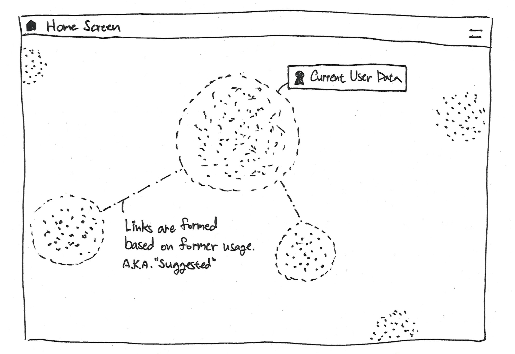
Cluster forms identity
We will explore the use of relativity to show connections and relationships (of different solutions). Example properties: size, shape, colour, fluidity, vibration, depth, speed, etc.
Crafting a Narrative: Scenario Generation
With our design drivers established, we began to craft a narrative, narrowing our focus to a set of potential target users and building a complete use-case scenario for the visualisation.
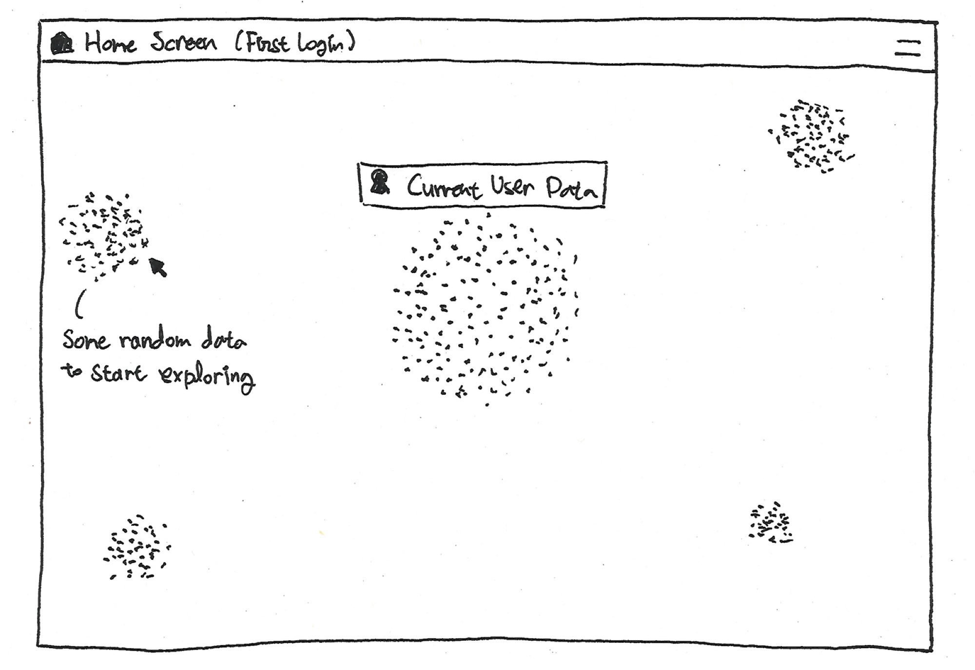
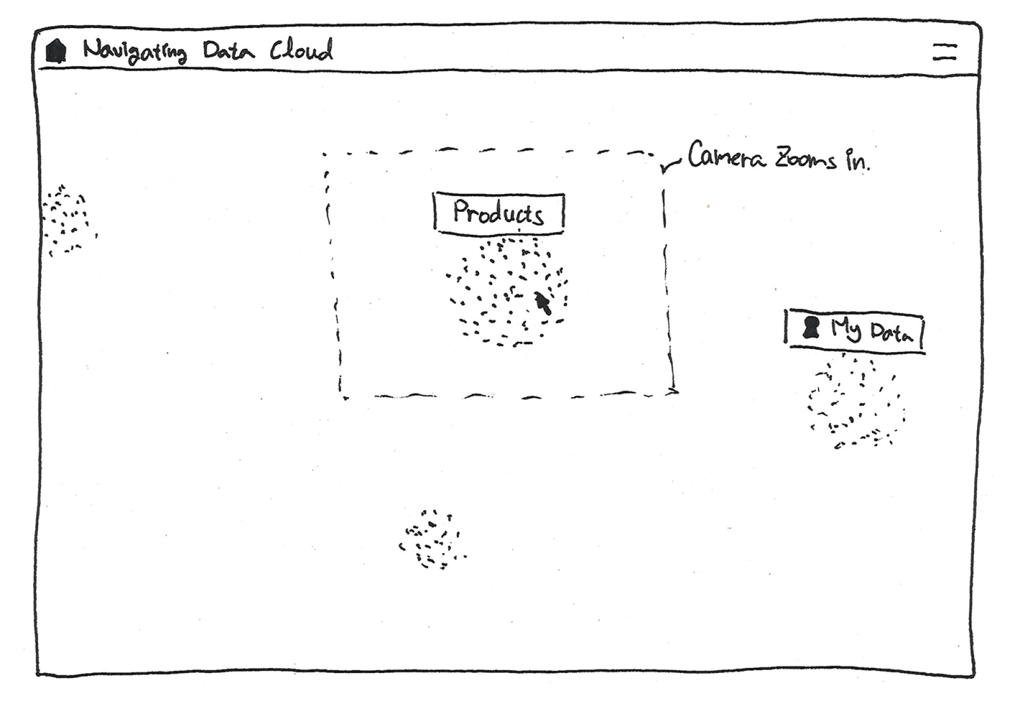
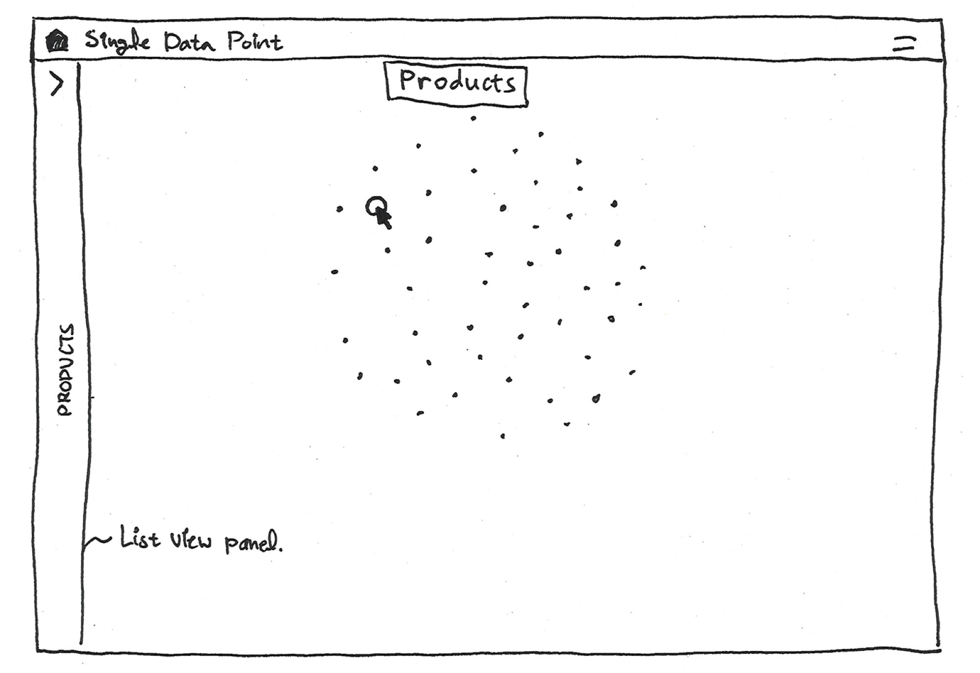
Outcome
In the ideation phase, it became clear that a static mockup would not be enough. To truly communicate the power of our vision, we needed a working prototype that would allow the client to experience the interactions firsthand. I worked closely with a visual designer and an interaction designer to prioritise features, ensuring we could deliver a compelling prototype within the given time constraints.
The result was a high-fidelity, fully interactive prototype that brought our concepts to life. Built on the foundation of our use-case scenario and design drivers, it demonstrated the power of our approach and set the stage for the final product.
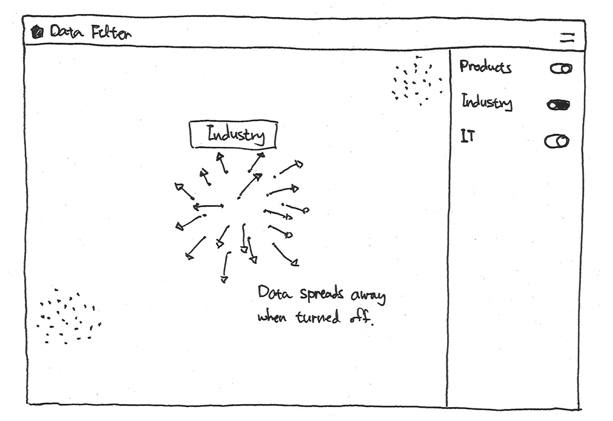
Noise Cancelling
Errant data can be switched on or off to allow for a pure focus experience or a noisier view to explore new connections.
Try toggling data below:
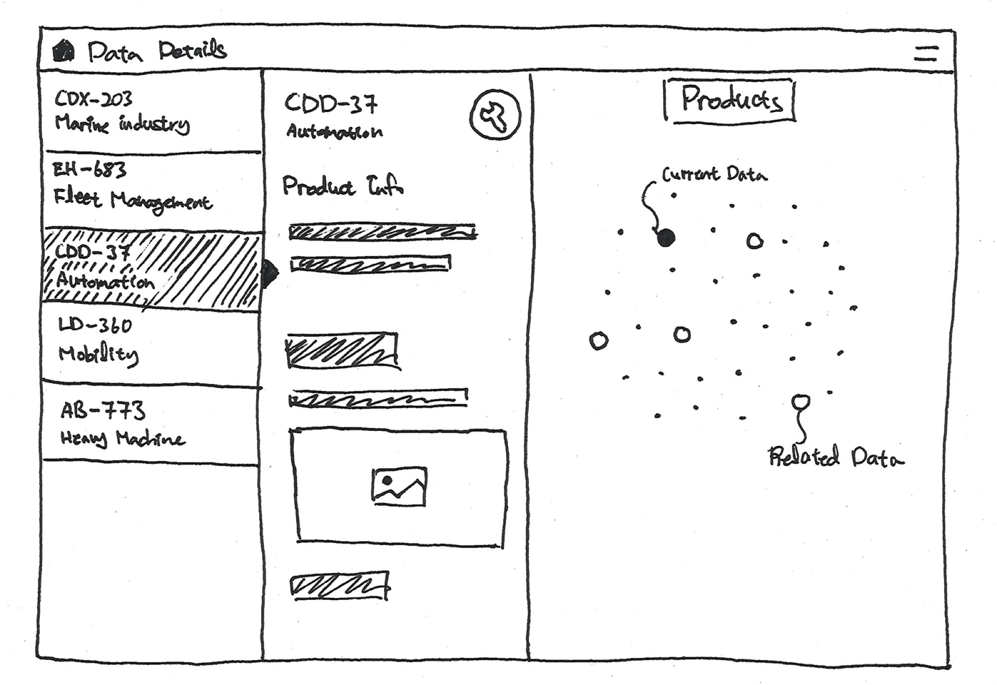
Clustering and Alignment
The easiest way of visualising the relevance of data is through clustering. With the help of the latest technologies, such as machine learning, this process can be done automatically to discover new patterns.
Different Points of View
A simple and one of the most common methods to view data in different ways. By combining recipes generated from the latest technologies, this simple approach can unveil unexpected insights.
Learnings
This was my first project as a dedicated Creative Technologist, and it was a formative experience. The unique challenges of the project provided a powerful opportunity to define my role within the studio and to demonstrate the value of a truly collaborative, technology-driven design process.
Championing the User-Centred Approach
Faced with a client who had a strong, preconceived aesthetic, we had to become champions for a user-centred approach. We were constantly challenged to justify the need for user research and use-case scenarios, and we learned to be strategic in our arguments, letting the results of our work speak for themselves.
The Creative Technologist as a Bridge
My role on this project was to be a bridge between the worlds of design and technology. With a background in design, I was able to actively participate in the creative process, not just as a technical consultant, but as a partner in expanding the team's design ideas through the lens of what was technologically possible.
Raising the Bar for Prototyping
My personal goal for this project was to demonstrate the power of high-fidelity, code-based prototyping. I pushed the team to move beyond static mockups and create a fully interactive visualisation. The success of this approach, delivered in just four weeks, convinced the studio of the value of this new way of working and set a new standard for our deliverables.