
What can we create with Spotify's Track Features API?
Introduction
Shortly after joining Fjord, I was invited to speak at Equinox, the company's largest annual event. The goal was to share a Creative Technologist's perspective on the evolving world of design.
I teamed up with two other new joiners from the Fjord Milan studio – a Visual Designer and another Creative Technologist – to explore potential topics. We quickly centered on the rising importance of data and APIs, and decided to create a project that would inspire our designer colleagues by showcasing the creative potential of these tools.
Our idea was to experiment with Spotify's Track Features API to generate unique visual artworks from music. Instead of a technical deep-dive, we aimed to create a visually engaging experience that would spark a conversation about the intersection of data, design, and creativity.
Approach
The main idea of this project was to play around with data to generate interesting visual outputs. I also personally wanted to generate something that made sense, rather than being too artistic. I decided to start by creating a chart with the available data to determine which track features would be most useful.

After some trials, I decided to use the seven track features shown above to generate a radar chart, with HSL colour extracted from the song's key, loudness, and tempo. These features are directly related to the song itself, which also means they are the most useful for visually finding out how a song feels.
At this point, I could already imagine an artwork generated by scattering the shape of the radar charts. By stacking them together in one place, I would also be able to easily compare the characteristics of multiple songs at a glance.

The first outputs I got were close to what I had expected. I tried to fetch track features from all the songs in the Global Top 50 chart and generate the above visualisations. From here, I started to experiment further by tweaking some parameters.
It's like generating an unexpected output with expected outputs!
I was inspired by the fact that the alignment of each radar chart makes a significant difference in the output's look and feel. I quickly added options to toggle randomisation for each chart's position and rotation to see the output.

As can be seen above, these simple tweaks already generated completely different effects, which was something I could not have expected. The shapes of the radar charts showed some similar patterns throughout the Global Top 50 chart (as a note, this does not necessarily mean these songs are similar; the pattern may come from the different scoring system for each feature), which gave the feeling of directional movement in the left example.
Similarly, the charts formed a nice radial pattern, as shown on the right, giving a somewhat joyful and playful feeling.
As I had limited time, I decided to stop here and proceed to make my final product – a visual synthesiser for Spotify albums.
Outcome
I took physical grid sequencers as a metaphor for my app. I already had some design directions suggested by the visual designer, so I could quickly proceed with my idea.
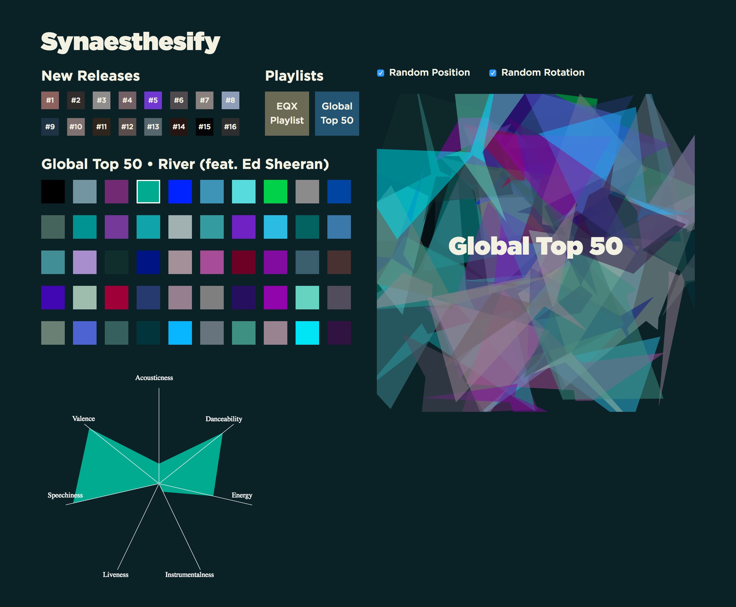
In the final design, users can generate an artwork from a selected album or playlist and also play around with the positions and rotations. Each song in an album is represented as a grid title, as shown above, which users can click to check the song's features.
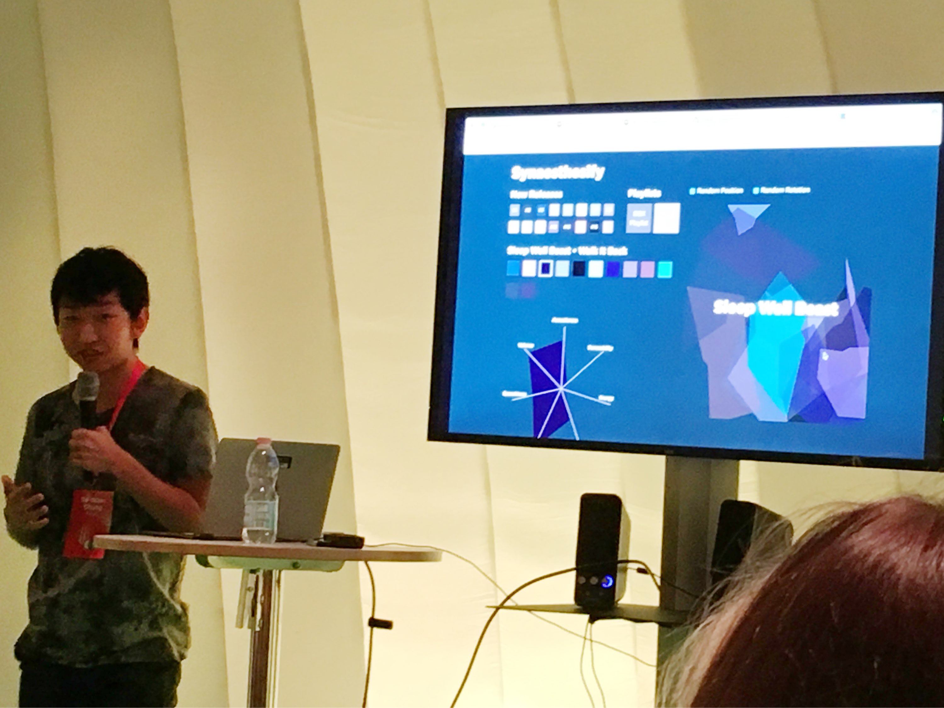
This work was presented in a pop-up session at Fjord's Equinox event, together with the Milan team and their own version of the experiments. We shared our learnings and initiated conversations around the topic with designers from all over the world.
Learnings
While this mini-project was simple and quick, it triggered many discussions in the talk. It became a good opportunity to share experiences from both the designers' and Creative Technologists' points of view.
Many designers were interested in collaborating with Creative Technologists but found the process somewhat difficult. As a team of new joiners, we were also keen to find out what the process had been in other studios and what we could suggest to improve it.
At the end of the talk, a designer from the Fjord London studio asked what designers could do to help Creative Technologists; our suggestion was that they could familiarise themselves with reading developer documentation on APIs to learn what data is available. This will not only help us build our logic but will also become food for thought for designing new products and services.