No one's gonna read a few-hundred-page research documentation. What can we do about it?
Introduction
Mobility is one of the world's most rapidly evolving industries, driven by a confluence of new technologies, emerging services, and shifting cultural attitudes towards transportation.
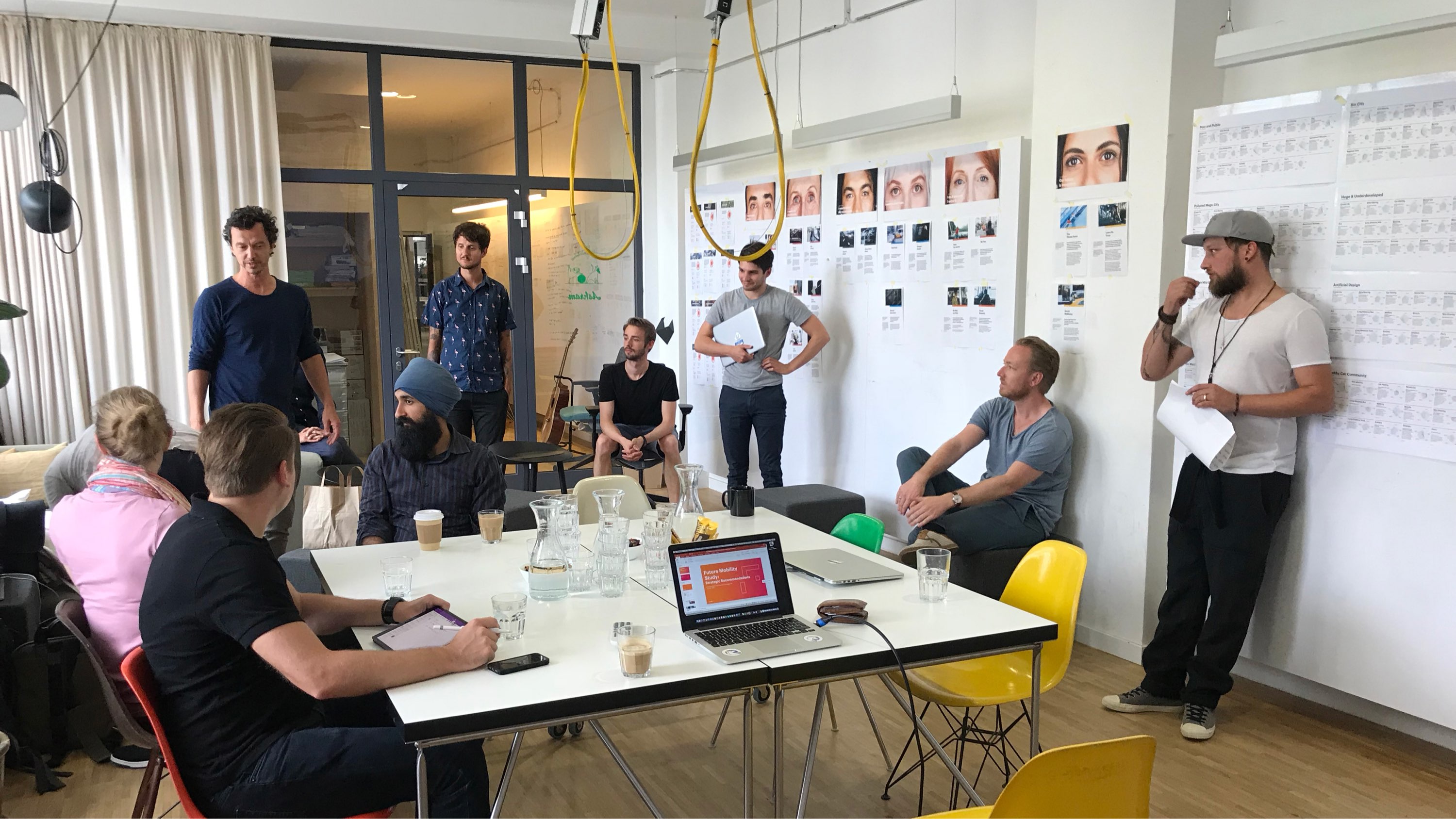
To understand these trends, a joint team from Fjord, Accenture, and Volkswagen conducted a series of global research studies, combining market analysis with human-centred insights to produce a comprehensive merged-view analysis.
While the findings were successfully compiled into a book, the sheer volume of information made it challenging to navigate. The team recognised the need for a more accessible and engaging way to explore the research, which led to this project.
Um... what do you mean by visualising qualitative data?
Challenges
When the team first reached out to me, the above was my immediate response. I was not fully convinced by the term data visualisation
they used, so I had to make sure we were all speaking the same language. We began our discussion by asking the following questions to align on our requirements.
Defining the Visualisation
What exactly did we want to produce? Were we sure we were not just creating another infographic or making things unnecessarily complicated? Since the term visualisation is so broad, we needed to understand what it meant in our context and what we were trying to achieve by creating it.
Defining the Logic
To generate a visualisation, it's obvious that we need a logic behind it. How were we going to parameterise qualitative research data? The team already had a good understanding of the requirements, so our discussion was more about the format in which we would parameterise the data.
Feeding the Data
Qualitative data usually requires a more complex input than numbers. The team was also in the process of iterating on their research, so I needed to come up with a solution that would allow them to directly input the data while I developed the application. This also meant potential risks of changes in the data structure.
Approach
Once these questions were derived, we went through them one by one to align ourselves. This process greatly helped us to kick-start our collaboration.
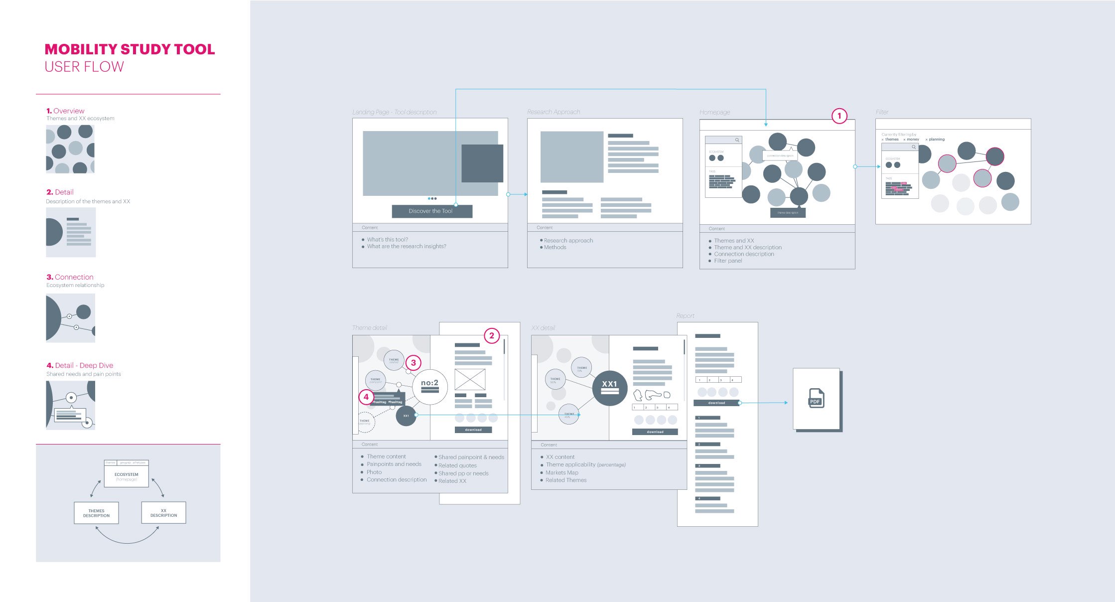
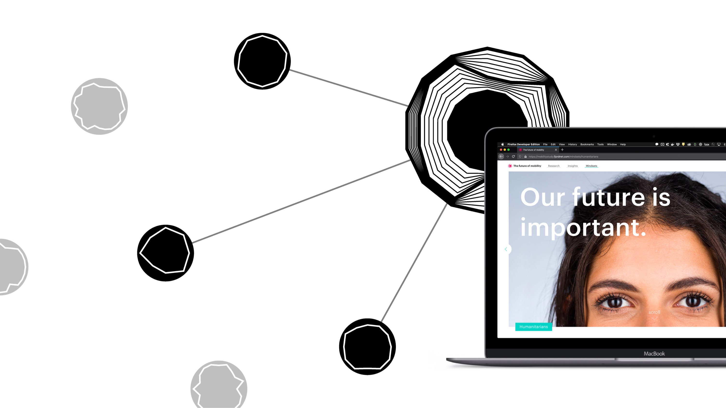
Interactive and Navigable Data Visualisation
The main benefit of a digital application is its interactivity, which enables users to navigate through relevant information. Unlike quantitative data, our research data could not be displayed in numbers, so it was crucial to sort it by relevance to maximise accessibility.
Thus, we defined our data visualisation as an interactive visual representation that allows users to easily navigate through the data. Furthermore, it should encourage users to learn new information by intuitively showing related data.
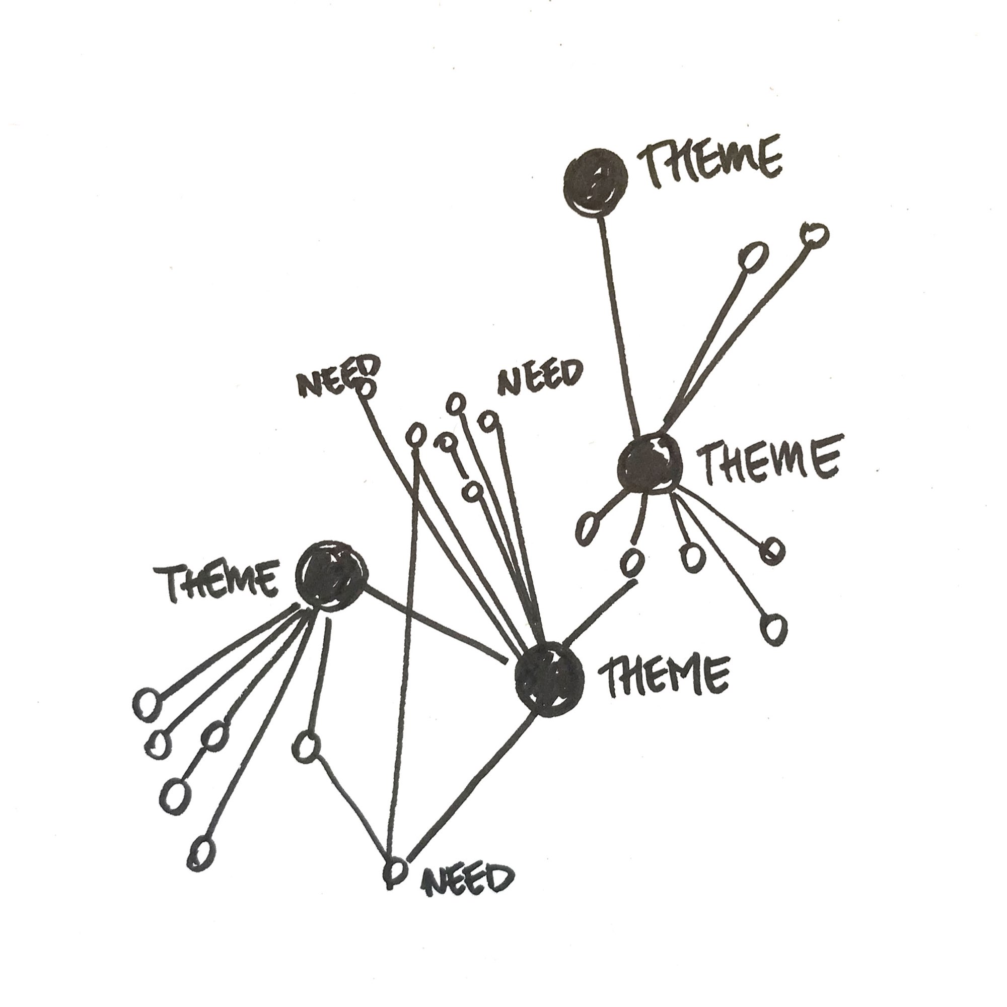
Keywords and Sentence-Based Parameters
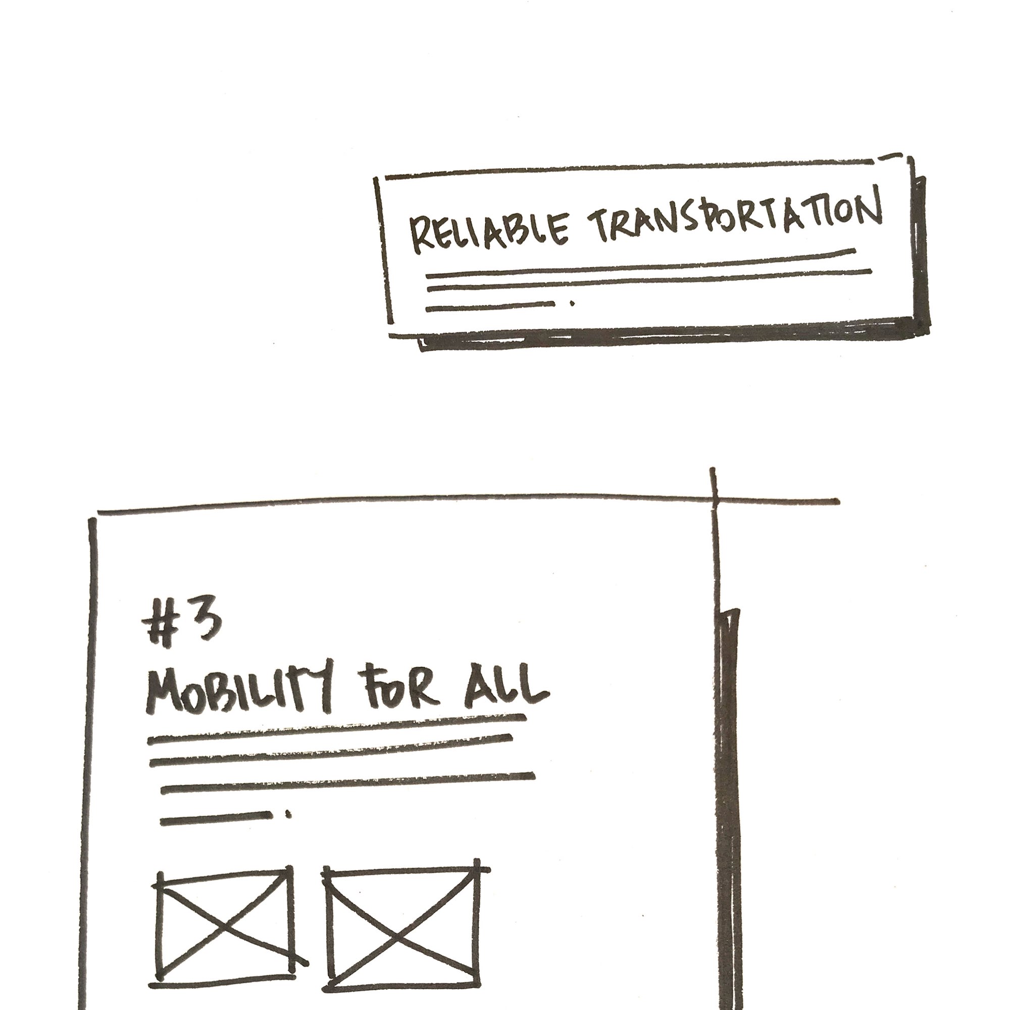
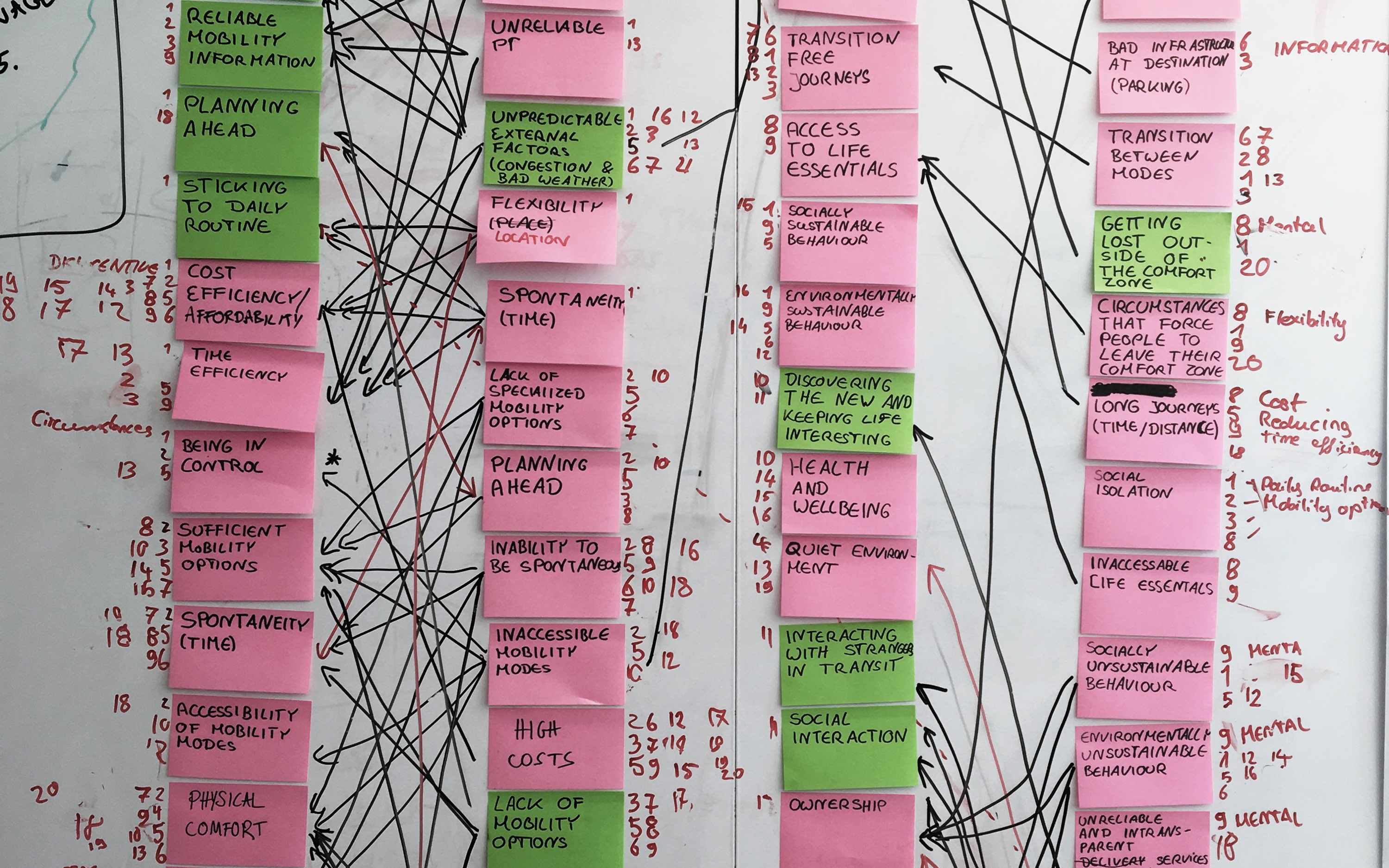
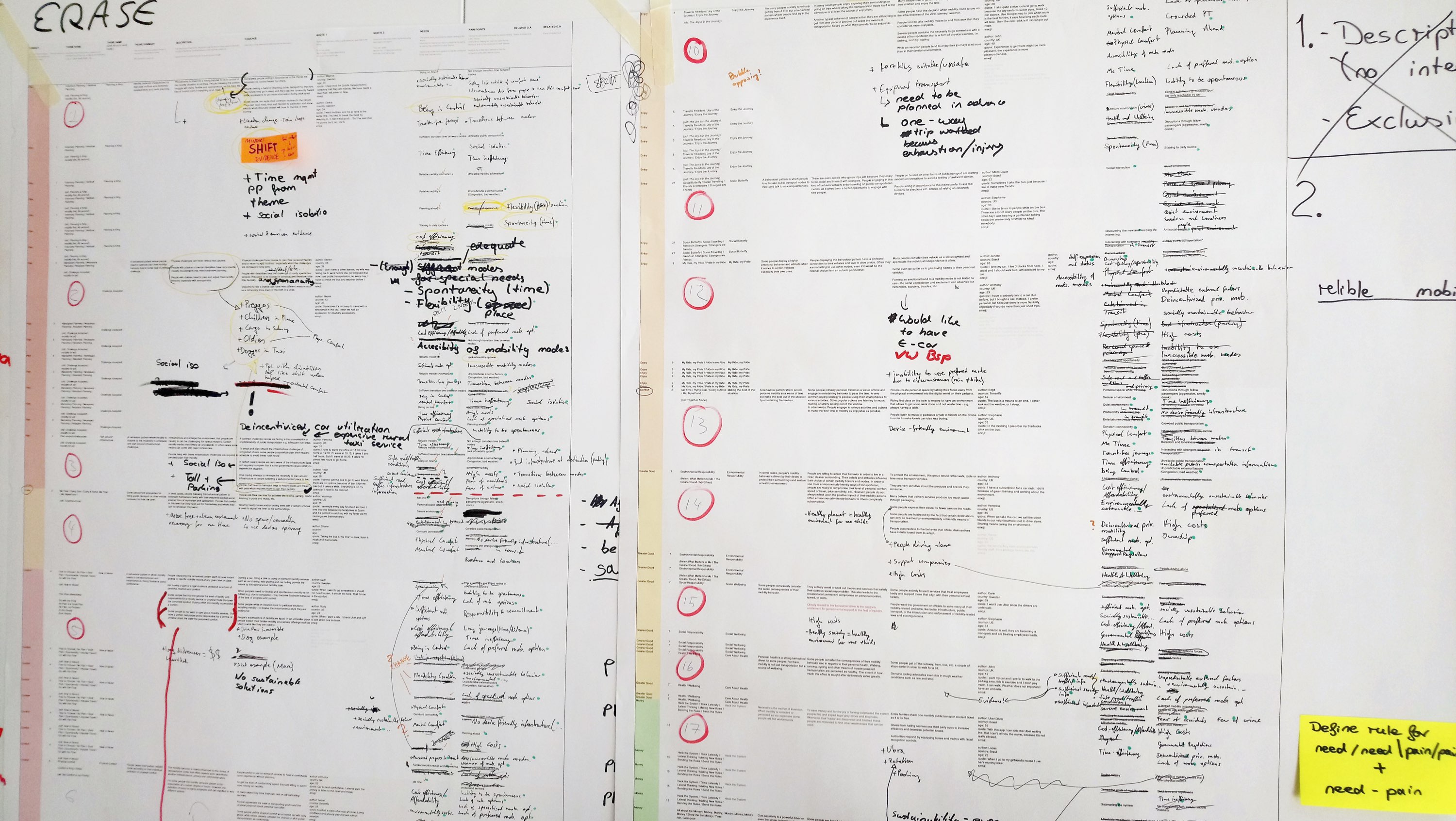
To build our logic for the visualisation, keywords were suggested as the parameter. The team was already well-aware of the necessity and was ready to extract them. Indeed, such a process is already common in design research analysis.
To save them time, I suggested they use natural words or sentences as keywords rather than spending time coming up with a single word. This allowed them to use, for example, representative user quotes selected from affinity diagrams as parameters.
Making Use of an Online Spreadsheet
The team was already collaborating with an online spreadsheet, which could be exported into xlsx format. I had a quick discussion with another back-end developer to check if it could be directly imported by writing a server-side script and confirmed it was possible with SheetJS.
As a result, we agreed to onboard another back-end developer to program the xlsx importing script to save our time and effort in filling in the data, and the team was able to continue working with their spreadsheet.
To best avoid the risk of structural and logical changes to the data, I carefully prioritised my tasks to give the team as much time as possible to digest their research.
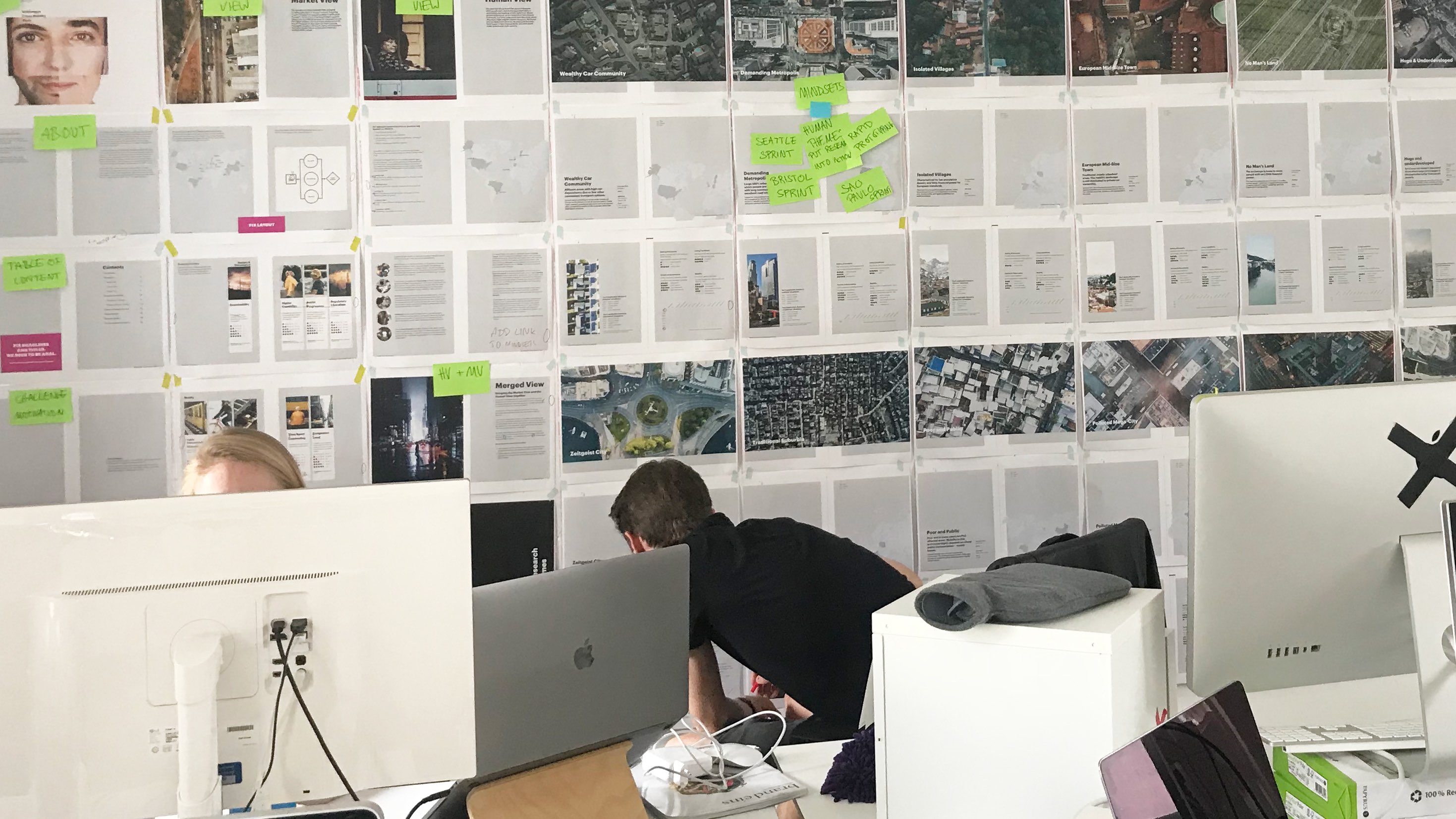
Process
After aligning ourselves, it was time to bring the concept to life. I took the lead developer role and onboarded a back-end developer to support me with processing the xlsx data while I developed the main application.
Data-Driven Visual Design
The collaboration with the designers was unique and interesting, as many elements were generated from data. I mostly worked with a visual designer to build our logic for the visual elements, as shown in the animation below.
As our concept continued to develop, we needed to design new logic to match our desired visuals, so I also joined ideation sessions to share my knowledge and design together.
Technical Setup
To make a highly interactive data visualisation, I needed to find the best options to generate and animate interactive elements.
During my research, I learned that SVG works very efficiently with CSS animations and, more importantly, that the React library could handle generating SVG nodes through JSX. Using React would enable me to implement more seamless interactions and animations by making it a single-page application.
Our data was fairly small, although complex, but I nevertheless decided to save it in a database rather than hard-coding it into JavaScript as JSON. This was mainly to save development time by working with a back-end developer in parallel.
We can always add more data, but not other data...
Coping with Uncertainty
In spite of our efforts, we could not avoid critical changes in the data structure. I tried my best to prioritise work that had fewer dependencies on data, but as the core logic changed, there was no other option but to restart from scratch.
To make things worse, a manager from Volkswagen requested that we not use GPL-licensed software. We were using MongoDB for storing our data, and all of a sudden, we were forced to seek an alternative.
Fortunately for us, these two issues came up at the same time, so we could deal with them simultaneously. While I was re-working on the front-end with the visual designer, the back-end developer worked on structuring the PostgreSQL database and new data importing scripts.
Outcome
After a month's delay due to structural changes, we were finally able to deliver the final application. Based on the internal tool we made, a public website was also designed and developed in a short period.
Controlling SVG
As a technical note, I preferred to use CSS transforms rather than inline SVG transformations to fully utilise CSS animations. This significantly saved development time but had the downside of not being able to export the generated visual into an SVG file. I later wrote a dedicated script with inline styles to share generated assets for the designers to use in their documentation.
I utilised Redux for state management to animate the SVG, combined with React Router. This combination allowed for sharing the desired visualisation through URLs, just like any other website.
Real-Time Coding
The public website development followed immediately after the visualisation project, with a very tight timeline. Although we already had all the assets ready, the visual designer and I had to progress very quickly to meet the deadline. Thus, we decided to design and develop in parallel, sitting next to each other.
For example, the visual designer would suggest visual and interaction ideas like the one above, and once I confirmed it, I would develop it quickly to get a feel for the look and feel. As it was a simple static website, this method worked very well to utilise both of our skills quickly.
Delivery
As there was no other developer from Volkswagen involved in the project, I had to think about how to deliver our application via a non-developer with minimal instructions. The team also did not know about their internal platforms for hosting applications, so I had to come up with a universal method.
As a result, we agreed to package the application with Docker. This greatly simplified the configuration process of the PostgreSQL and Node server – not only for them but also for ourselves to share our outcome internally.
Learnings
This was one of the most difficult development projects I have had so far, with challenges coming from various aspects – from the coding itself to the corporate setup. This process taught me valuable lessons and left me with some remaining open questions.
Modes of Collaboration
The collaboration process with the designers was the core challenge, as the application concept was continuously evolving in parallel with development. I had to quickly figure out which parts could be done independently and which had to be done together with the designers, as mentioned earlier.
Especially during the public website production, there was absolutely no time for me to wait for design confirmation. The visual designer and I agreed to sit together and design and develop at the same time. I literally implemented the design in real-time, and this actually worked out great.
Obviously, this was possible because the design direction was already defined from the internal prototype; however, such a mode of collaboration would be very useful in many situations where quick – but fully working – prototypes are needed.
Double-Checking the Client's Requirements
We were lucky (and unlucky) to have two game-over situations happen at exactly the same time, saving us from restarting for another round. While changes in the data structure might have been extremely difficult to predict, the license issue could have been definitely avoided.
I learned that the use of open-source solutions needs to be discussed thoroughly as part of the technical requirements during planning. As the use of freely available dependencies is almost unavoidable in modern web development, developers, including me, often neglect the importance of the licenses associated with them. I took this experience to add such a factor to my pre-development checklist for my next projects.
How to Best Avoid Structural Changes in Data?
As a Creative Technologist, I often face situations where prototypes are urgently needed, but the ideas are not finalised. This always comes with the risk of losing all my work due to last-minute changes. This is usually manageable, as they don't always require a complex data structure.
However, in this project, such a change was critical, and in spite of my efforts, I could not avoid starting all over again. As a non-expert in data architecture, it was very difficult for me to predict every scenario and make my code expandable enough to cope with such situations.
Later, I shared my experience with other developers and Creative Technologists, but we all agreed that in such a project setup, the risk cannot be completely removed, and thus it remains an open challenge for all of us.